Matching Family Outfits That Don't Look Cheesy
The gap between coordinated and costume is almost entirely about restraint.
Matching family outfits are not the problem. Overmatching is.
The premise is reasonable. A new baby arrives, everyone is in the same household, someone is going to photograph this, and the family wants to look like they belong together. The impulse toward coordinated clothing is not vanity — it is practical visual coherence. The problem is what usually gets done with it.
Most matching family outfits are designed around a single moment: the photo. The silhouettes are identical. The colors are coordinated to the point of uniformity. The print — if there is one — is loud enough to read across a lawn. And on the day of the shoot, everything is fine. The photo happens. The results are posted. But the clothing was never meant for the other 40 days of normal life, and everyone can tell.
The better version starts from a different question. Not “will this look unified in a photo” but “would each person wear this on its own, without the matching context?” That is the test. Coordinated clothing that survives individual scrutiny — where the baby’s piece works as a baby outfit and the adult piece works as an adult outfit — does not need a family photo to justify its existence.
This is a guide about that version.
Coordinate More Than You Match.
If you take nothing else from this guide: coordinate, do not match.
Matching means everyone is wearing the same thing, scaled up or down. The baby has the same pattern as the parent. The graphic is identical across all sizes. The palette is a direct copy. It reads as a costume because it is one — all participants have been dressed by the same hand, in the same visual idea, for one specific purpose.
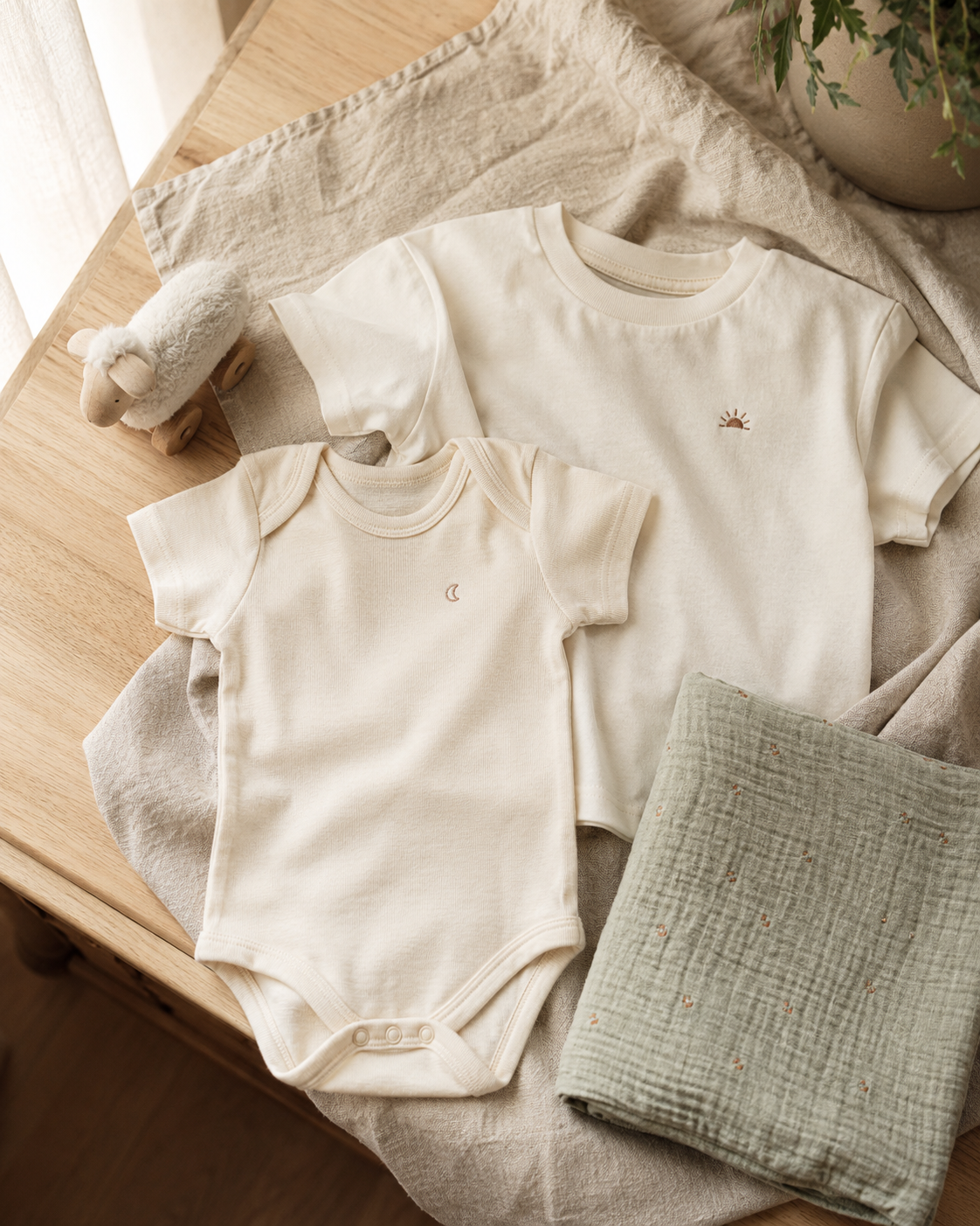
Coordinating means the pieces share a reference point without being copies of each other. Same color palette, different silhouettes. Same design language, different phrases. Same fabric tone, different garments. The family looks like they inhabit the same aesthetic world without looking like they shopped from a single product page at the same time.
One looks like a decision that was made about clothing. The other looks like a decision that was made about a photo.
Matching Family Outfits Are Cheesy When They Exist Only for the Camera.
The category has a structural problem almost identical to the one in funny baby clothing: the purchase incentive and the wear incentive are in conflict. A matching family set that earns an “aww” at the moment of gifting has already done most of what it was designed to do. After that, you have to actually wear it.
What produces cheesy results:
Identical everything. The surest route to costume territory is everyone wearing the literal same design, differentiated only by size. The visual effect is uniform rather than coordinated. It communicates “we were styled for this moment” even if that was not the intent.
Holiday-specific pajama energy. There is an entire aesthetic defined by red plaid flannel, embroidered names, and “Our First Christmas” written in script across a matching set. This exists for one night. The question is whether the design says “we put effort into this holiday” or “someone bought us a matching set.” The line is narrow and depends almost entirely on execution.
Loud graphics across all sizes. When the same bold graphic — a statement, an illustration, a seasonal print — appears on every family member, the eye registers “matching” before it registers “clothing.” The graphic becomes the story. The people wearing it become props for the graphic.
Anything designed exclusively for a photo context. If the clothing would look out of place in a casual Tuesday-morning kitchen photo — if it requires the photo setup to make sense — it was not designed for the family. It was designed for the image.
Novelty-site aesthetics scaled to a family. The kind of print that looks like it was sourced from a search for “funny family matching shirts” rather than selected as clothing the family would actually choose. You can usually tell by the product photo: white background, identical fonts, generic staging.
Tasteful Coordinated Outfits Survive Individual Scrutiny.
The difference between cheesy and tasteful in family coordinating is not a matter of taste — it is a matter of design intent. Pieces designed as clothing first and coordinated second almost always look better than pieces designed as a matching set first.
Each piece holds up on its own. The test: would you put the baby in this if no one else in the family was wearing anything related? Would the adult wear this tee on a weekend without the coordinating context? If yes to both, the coordination is genuine. If the pieces only work together, they were designed for the photo, not for the people.
The coordination is in the palette, not the pattern. Sharing a color story across different garments — a parent in sand, a toddler in cream, a baby in oat — reads as coordinated without reading as uniform. The eye notices the family cohesion. It does not notice the coordination mechanism.
Typography and graphic restraint. When coordination is communicated through shared design language — same font family, same color weight, same tone — rather than through identical graphics, the result is more editorial and less costume. One quiet phrase on one piece is more intentional than the same graphic repeated across three sizes.
Wearable past the occasion. A coordinated family outfit that only works for a specific photo shoot, a holiday, or a single event is furniture. A coordinated family outfit that works for a first birthday, a weekend brunch, a casual walk, and still photographs well at six months is clothing.
Soft, natural fabrics across the set. The material is part of the message. Matching in natural cotton or a quality fleece says the family chose the pieces for comfort. Matching in thin synthetic material says the priority was the visual, not the wear.
“The test for any coordinated family outfit: would each piece hold up if no one else was wearing the matching version?”
The Real Difference Between the Two.
These terms get used interchangeably. They are not the same thing.
Matching means the visual components are the same across sizes. Same print. Same graphic. Same phrase. Same pattern. The only variable is scale. This is what produces the “family costume” effect, because the intent — everyone wearing the same thing — is visible in the garment.
Coordinated means the visual components share a reference without being copies. They exist in the same aesthetic world. Someone looking at a coordinated family set would notice the family looks like they belong together. They would not notice the coordination mechanism.
The most useful illustration: imagine two photos. In the first, everyone is wearing the same plaid, scaled. In the second, the parent is in a warm sand crewneck, the toddler is in a cream tee with a simple phrase, and the baby is in a natural bodysuit in the same design language. The first is matching. The second is coordinated. The first communicates “we wore matching outfits.” The second communicates “this family has a coherent style.”
The difference is almost never about cost or brand. It is about whether the design intent was uniformity or coherence.
A Simple Color Framework for Family Coordinating.
Color is the fastest route to either cohesion or disaster. These rules are not strict — they are patterns that work reliably.
Start with one neutral anchor. Natural, cream, ivory, sand, warm white. This is the baseline that makes everything else readable. Baby pieces in neutral fabric already photograph well; adding more pieces in the same tonal range creates coherence without effort.
Two tones, three pieces. One base tone (cream, natural) and one accent (warm sand, dusty terracotta, soft sage) across three pieces creates a palette that reads as intentional. More tones become a collection; fewer can feel too matched.
Avoid pure white. White photographs well in a studio. In a real home with natural light, it reads clinical. Cream and natural fabric are warmer, more forgiving, and photograph closer to how they actually look in person.
Stay in the same temperature. Warm neutrals (cream, camel, oat, sand, terracotta) coordinate easily with each other. Cool neutrals (grey, slate, navy) do the same within their range. Mixing warm and cool in the same family set usually produces tension the camera will find even if the eye does not.
Use pattern sparingly, if at all. A subtle stripe or minimal print on one piece in a set can work. The same pattern repeated across every piece returns to matching territory.
Test in the actual light. A coordinated set that looks coherent on a product page in studio light may look different in the light of your living room or your backyard. If the family photo is outdoors in afternoon light, that is where the test should happen.
How to Use Text and Graphics Without Losing the Outfit.
When a coordinated family set includes text or a graphic element, the design choices either earn the coordination or undermine it.
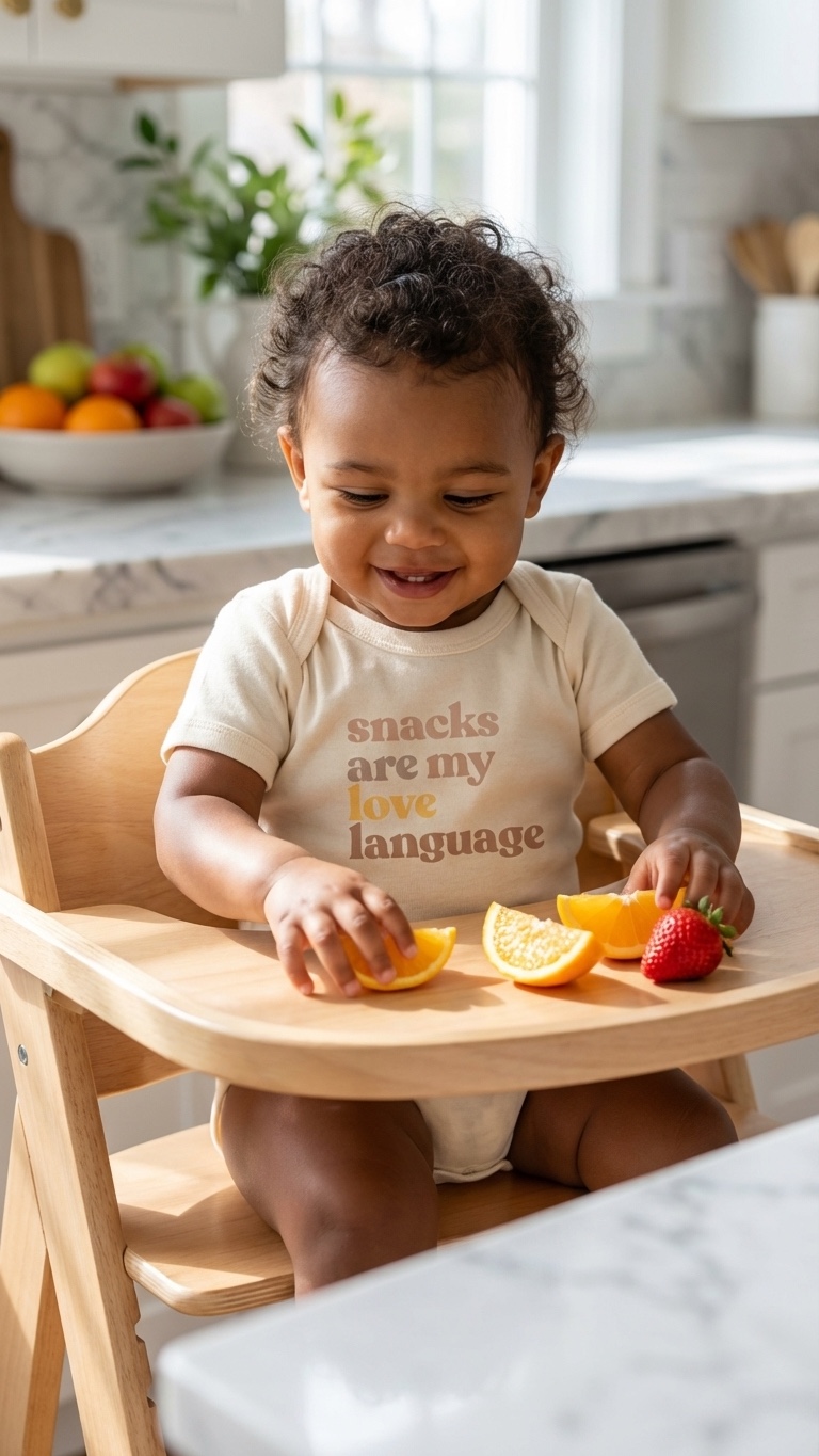
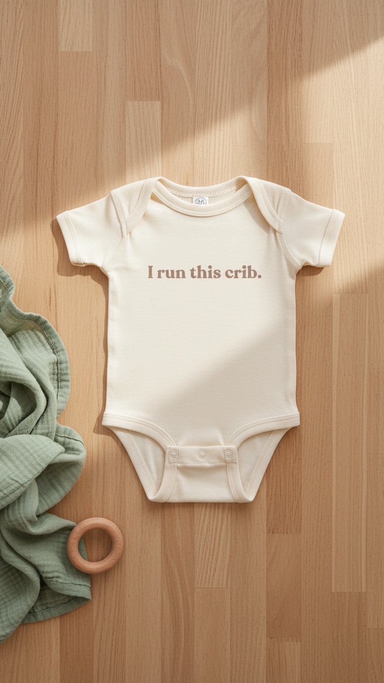
One phrase is enough. If the visual idea is a text design, one piece with the phrase is often better than the same phrase on every piece. A baby bodysuit with a quiet observation lands differently — and better — than three identically-phrased garments stacked in a photo.
The phrase should describe the family, not the occasion. Occasion-specific text — “Our First Holiday,” “Family Trip 2025” — dates immediately. A phrase that describes something true about this particular family — their dynamic, their humor, their priorities — remains accurate past the occasion it was chosen for.
One font, one weight, one color per piece. If the coordination is between pieces in the same design language, the visual coherence comes from consistency across pieces, not from graphic density on any single one.
Avoid graphic and text on the same piece. A clean illustration does not need a label. A strong phrase does not need a supporting graphic. Pieces that combine both usually signal that the designer did not trust either.
Scale the text to the garment, not to the photo. A phrase that needs to be large to read across a room was designed to be read in a photo, not to live on clothing. Text that fits proportionally on a real garment — that would look right on someone you passed on the street — was designed as clothing.
The Occasions Where Coordinated Family Outfits Actually Earn Their Place.
Not every occasion warrants coordinated family clothing. These are the ones where it works.
First birthday. The most photographed single occasion of the first year. A restrained coordinated set — one where everyone looks like themselves but is in the same color story — photographs well and reads as intentional without looking like a costume. For gift buyers, this occasion is explored in more detail in first birthday gifts.
Family announcement photos. Pregnancy announcements, newborn introductions, new sibling reveals. The photo is the purpose. Coordinated clothing that communicates “this family has a coherent visual identity” serves that purpose better than either uncoordinated clothing or overtly costume-like matching.
Holiday photos — with restraint. The strongest holiday family photos use coordination as a background, not a foreground. A consistent warm palette reads as “holiday warmth.” Identical holiday-print pajamas read as “matching holiday pajamas.” The distinction is whether the clothing serves the moment or announces itself.
Baby shower or new baby gifts. A well-chosen coordinated set — a baby bodysuit and a piece for the parent in the same design language — is a thoughtful gift because it anticipates the photo the family will take. What size baby clothes to buy as a gift covers the sizing logic for this specifically.
Travel and casual group photos. Low-pressure coordination — more about visual coherence in casual photos than about any single occasion. The coordination can be very loose: same palette, loosely consistent silhouettes.
Everyday life. The least-discussed but most durable version. A toddler and parent who end up in the same palette because those are the clothes that are soft, well-made, and already in the drawer. This looks coordinated without any effort to be coordinated. It is the most honest version of the category.
“The best coordinated family outfits do not look like they were planned. They look like a family that already has good taste.”
The planning is invisible. The clothes are the thing.
How to Buy Coordinated Family Sets Without Getting It Wrong.
Matching family outfits are a reasonable gift category for baby showers and new baby occasions. They are also one of the easier gift categories to misjudge. Here is how to reduce that outcome.
Read the family first. Some families will photograph everything and love a coordinated set. Others find matching outfits too staged. The difference is usually visible in how they dress, how they photograph their kids, what they share. If it is not clear, a practical gift is the safer call.
Prioritize quality over novelty. A coordinated set in soft, natural fabric is a better gift than a novelty matching set in thin synthetic material. The quality signals the intent. It says “we thought about this family and chose something they would actually want to wear.”
One piece can stand for the set. A well-chosen baby bodysuit in a design that also exists in an adult version — so the parent can opt into coordination without being required to — is a lighter, less presumptuous version of the matching gift. The family participates in the coordination on their own terms.
Buy a useful size. The same sizing logic that applies to all baby clothing gifts applies here: 3-6M gives the piece more life than 0-3M, which is often outgrown before the photo ever happens. The full reasoning is in what size baby clothes to buy as a gift.
Stay out of the holiday lane. A coordinated set that is not occasion-specific is wearable longer and photographs well more than once. A holiday-specific matching set has a narrow window and then becomes a drawer object.
For a wider view of thoughtful new baby gifts, gifts for new parents covers the category beyond clothing. For gifts where humor is part of the intent, funny baby shower gifts covers that angle specifically.
Coordinated Without Costume.
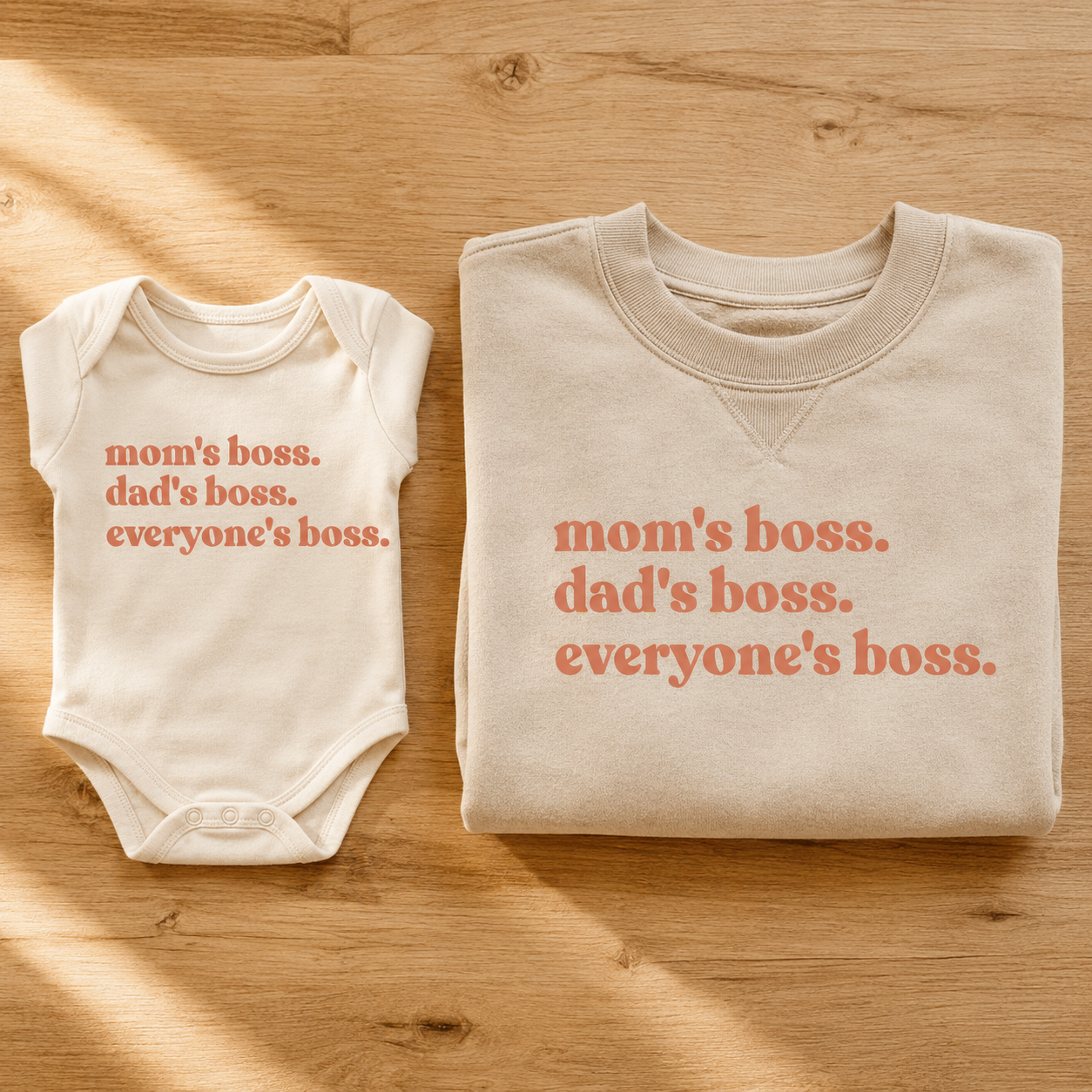
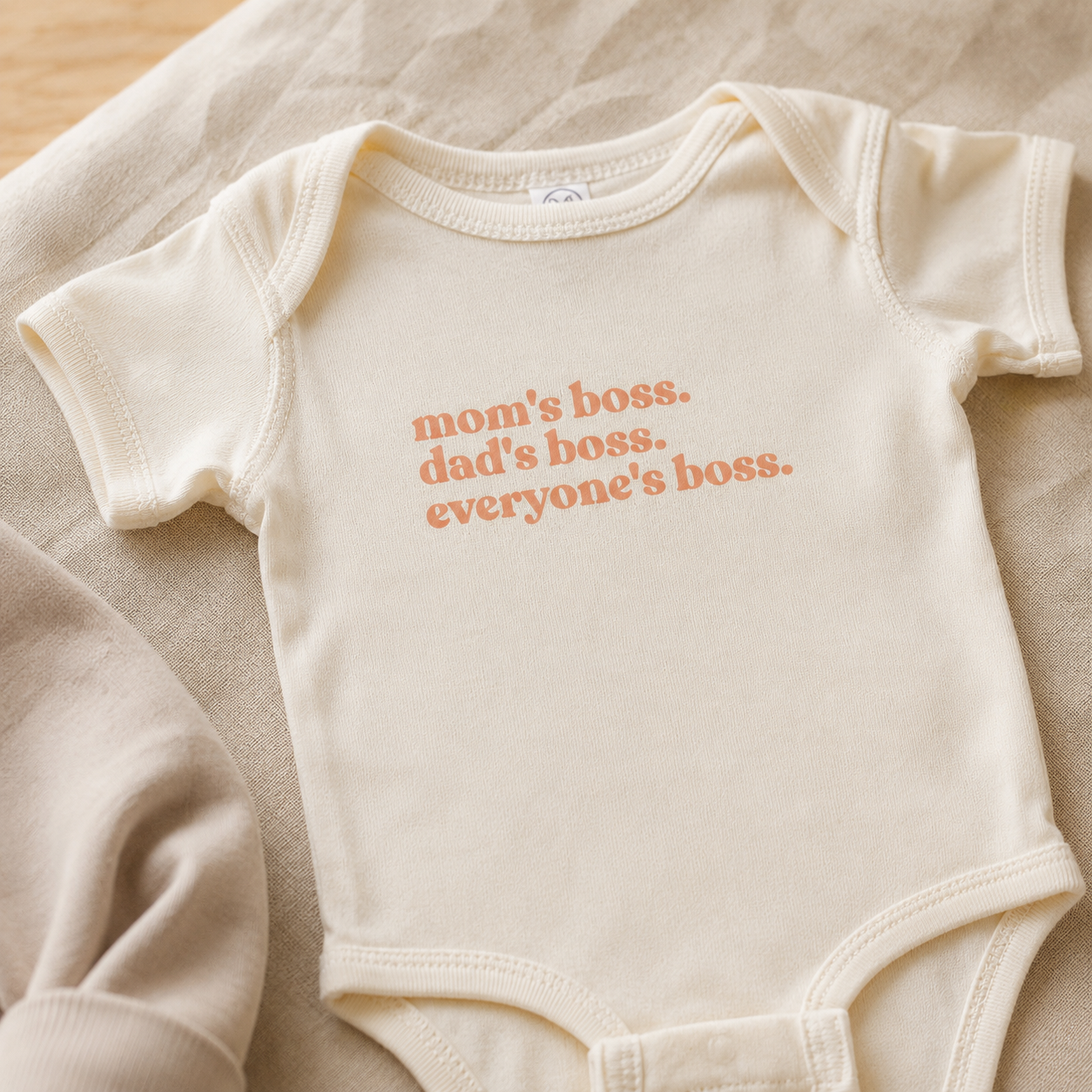
The “Mom’s Boss. Dad’s Boss. Everyone’s Boss.” design exists in every size — baby bodysuit, toddler tee, youth, and adult sweatshirt. Not because it was designed as a matching set, but because the observation it makes is true at every scale: whoever runs the household, it is very clearly not the person with the most authority on paper.
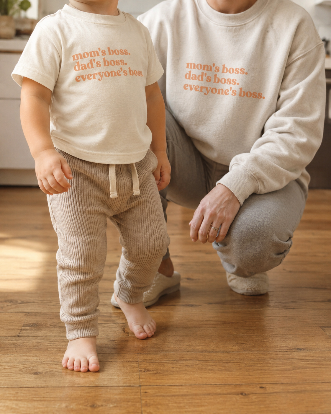
That is also why it works as a coordinated family piece. The phrase does not require everyone to be wearing the same garment to land. The adult in the sand sweatshirt and the baby in the cream bodysuit are making the same joke at different volumes. One is the setup; the other is the punchline. Together they are funnier than either alone — but they also work separately, which is the thing that distinguishes coordinated from matched.
The fabric matches the tone: natural cotton, clean typography, one color. No secondary graphic to explain the joke. No border, no embellishment. The restraint is the design.
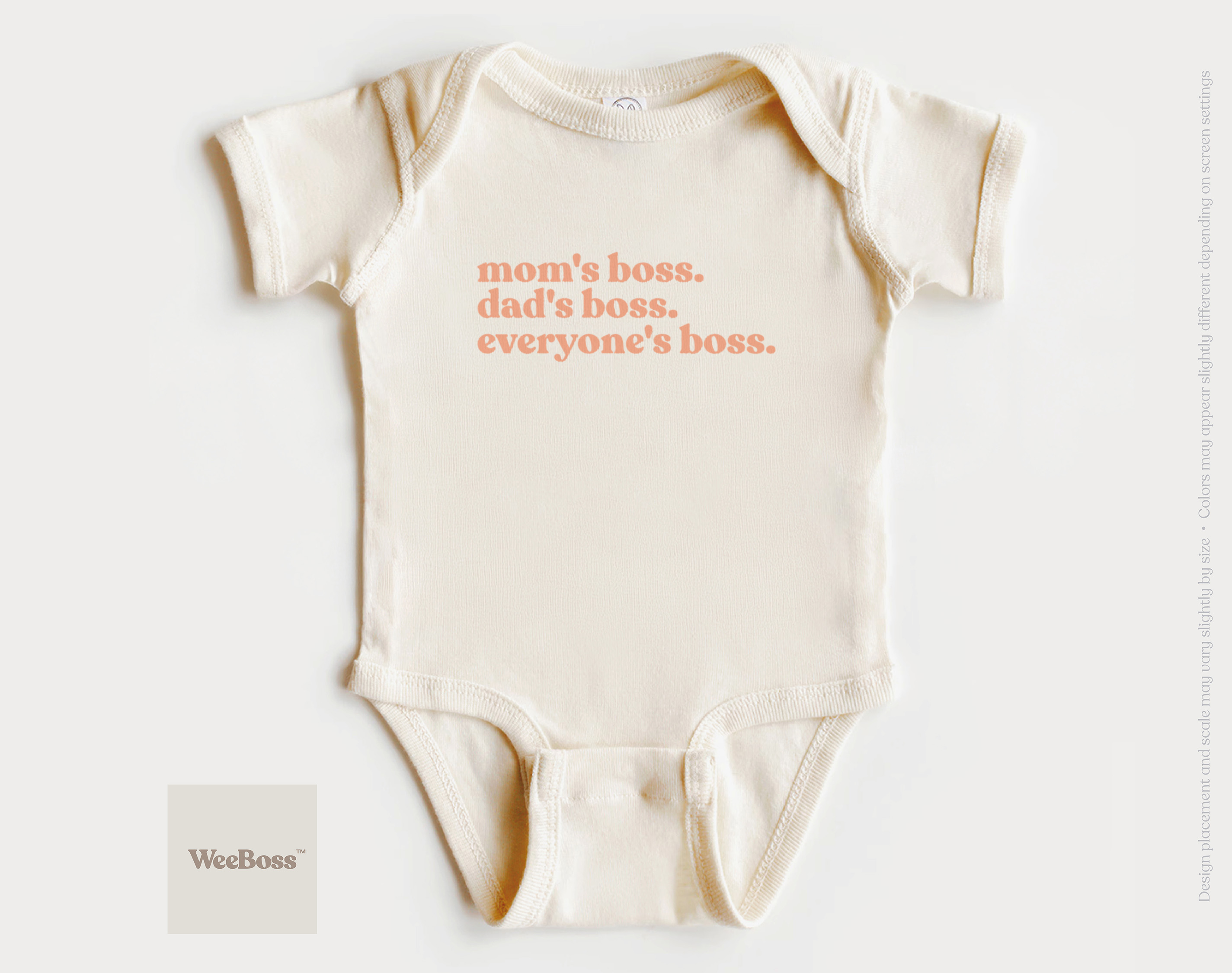
Mom’s Boss. Dad’s Boss. Everyone’s Boss.
Available in every size — baby bodysuit, toddler tee, youth, adult sweatshirt. One phrase that lands the same joke at every scale. Coordinates without costume. Natural cotton, one color, no explanations.
View on Etsy →
For families who like coordinated clothing but not the aesthetics of the typical matching set — where everyone looks like they were dressed by the same hand for the same photo — the WeeBoss design language is a different entry point. One phrase, across sizes, in the same fabric tone. Coordinated in the way that clothing can be coordinated without being costume.
For more on the baby bodysuit as a gift format, baby bodysuit vs. romper: which makes the better gift? covers the practical differences. For humor as a thread through a coordinated gift, funny baby clothes: what feels clever and what feels tacky covers the adjacent territory.
More on Family Clothing and Gifts.
If this article helped clarify the coordination question but left others open:
- Funny Baby Clothes: What Feels Clever and What Feels Tacky — what makes humor on baby clothing work, and what makes it feel cheap
- Baby Bodysuit vs. Romper: Which Makes the Better Gift? — the garment decision before the coordination decision
- What Size Baby Clothes to Buy as a Gift — sizing logic for baby clothing gifts, by occasion
- Gifts for New Parents — the full new parent gift context beyond clothing
- First Birthday Gifts — the occasion most commonly associated with coordinated family photos
- Funny Baby Shower Gifts That Don’t Feel Generic — when coordination and humor overlap as a gift category
A Short Answer If You Are Still Deciding.
Coordinated family outfits work when:
- Each piece holds up on its own, without the matching context.
- The coordination is in the palette or design language, not in identical graphics.
- The fabric is soft and natural — quality communicates intent.
- The phrase or graphic, if there is one, describes something true about this family specifically.
- It photographs well in a real home on a random Tuesday, not just at the planned shoot.
- It survives past the occasion it was chosen for.
They do not work when:
- Everyone is wearing the literal same graphic at different scales.
- The design was optimized for a single photo, not for 40 wears.
- The print or text is occasion-specific and dated within a season.
- The fabric is thin or synthetic — the material tells you the design intent was the purchase, not the wearing.
- You can tell from the product photo that it was designed to be searched for, not chosen.
The gap is almost never about how coordinated the set is. It is about whether the coordination was designed around the clothing or around the photo.